Initial Design
Design Approach:
- Muted tones to highlight content priority.
- Emphasis on readability and user comfort.
- Minimalist interactions with light iconography and typography.
- Subtle contrast to avoid visual overload, guiding users through an unobtrusive flow.
In the initial pitch, the design concept revolved around using a muted color palette to create a minimalist and professional environment. The soft tones promoted readability, focus, and simplicity. The interface maintained ample white space and clean typography, balancing between content and visuals.
Key elements like CTA buttons and icons were designed to stand out subtly, ensuring users could interact without feeling overwhelmed by bright colors.
Key elements like CTA buttons and icons were designed to stand out subtly, ensuring users could interact without feeling overwhelmed by bright colors.

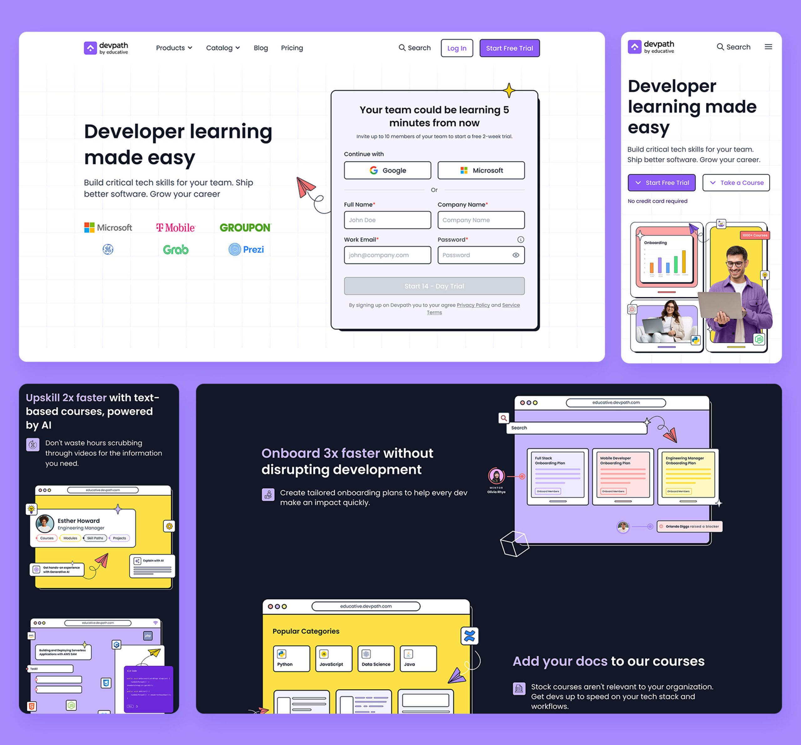
Final Design: Vibrant Palette
Design Approach:
- Vibrant colors to reflect energy and innovation.
- Strong contrast for better visual hierarchy and interaction.
- Animated graphics and illustrations to add a playful and engaging element.
- Highlighting key areas like “Trending Topics” to direct focus and enhance exploration.

